Case Study
Business Buddy
From cluttered to compassionate:
reimagining a marketing agency's digital identity
Note: Some process visuals are withheld under NDA. Where images would appear, their purpose and content are described in the text.
Context
The client and the brief
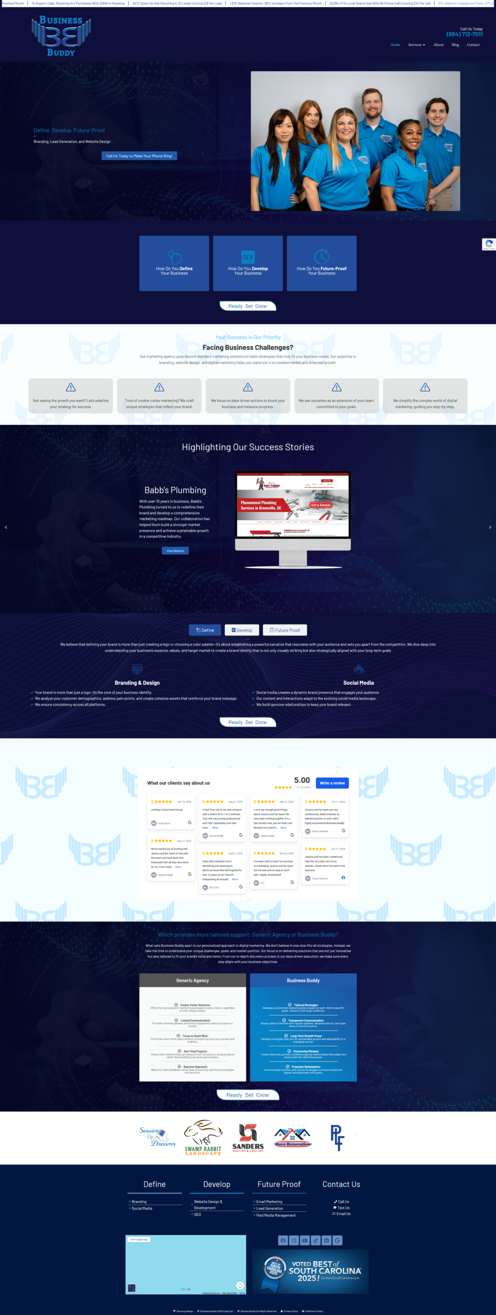
Business Buddy is a marketing agency built around a clear mission: helping small businesses define their direction, develop their presence, and future-proof their growth. Their tagline “Define. Develop. Future-Proof.” captures an approach that is hands-on, empathetic, and strategic.
The problem was that their website didn’t reflect any of it.
I was brought in as Lead Website Specialist with full responsibility for design strategy and execution across the agency’s digital presence. The Business Buddy site was one of the most significant projects in that role, a full redesign and rebrand of their own platform, which served as both a client-facing tool and a live demonstration of the agency’s capabilities.
Problem
A site that contradicted the brand it was selling
The existing Business Buddy site communicated expertise through its content, but visually it worked against the brand in almost every dimension. The layout was cluttered and cognitively demanding. The visual tone was cold, at odds with the warm, supportive positioning the agency expressed everywhere else, particularly across social channels. And the structure made it difficult for visitors to understand quickly what Business Buddy did and why they should trust them with their business.
For a marketing agency, this was a credibility problem. A firm selling digital strategy and brand development to small businesses needs its own site to be the most convincing thing in its portfolio. The existing site was not that.
The core design challenge was twofold: bring the visual experience in line with the brand’s emotional register, and restructure the layout so first-time visitors could orient, build confidence, and take action without friction.
Research
Understanding where the existing site was failing
Before any design work began, I conducted a structured audit of the existing site to identify where the experience was breaking down. The audit focused on visual hierarchy, content structure, navigational clarity, and the gap between how the brand presented itself on the site versus across other channels.
Key findings from the audit:
- The homepage tried to communicate too much at once, with no clear hierarchy to guide visitors through the content. High-value information, what the agency does, who it’s for, why it’s different, was buried beneath visual noise.
- The colour application and typography created a formal, corporate tone that clashed with the approachable, supportive voice used in Business Buddy’s social presence and client communications.
- Navigation was structured around internal logic rather than visitor intent, making it harder than necessary to find core service information or contact details.
I supplemented the audit with stakeholder interviews to understand how the Business Buddy team described their own brand, what they felt the site was getting wrong, and what success looked like for them. A competitive analysis of peer agencies established visual benchmarks and identified conventions worth following and a few worth deliberately breaking.

Process
Redesigning from the inside out
With the audit findings and stakeholder input as the foundation, I structured the redesign process to validate direction before committing to execution.
- Visual direction and mood boarding. Drawing from the audit findings and stakeholder input, I explored visual directions that could close the gap between the brand’s emotional register and its digital presence. The chosen direction leaned into soft neutrals and warm blues, a nod to the existing brand palette, paired with generous white space and approachable typography. Soft greens introduced notes of growth and safety; clean neutrals anchored the layout in simplicity and calm. The goal was a site that felt like a trusted partner, not a corporate service provider.
- Information architecture restructure. Before touching visual design, I restructured the content hierarchy and navigation to match how a prospective small business owner would actually move through the site, arriving with uncertainty, needing to understand the offer quickly, then building enough confidence to make contact. This meant surfacing key messaging earlier, simplifying the navigation structure, and creating a cleaner path from awareness to enquiry.
- Wireframing for layout validation. I produced wireframes across key pages to validate the new structure before investing in high-fidelity design. This kept the process efficient and gave stakeholders a low-commitment way to review and respond to layout decisions before the visual layer was introduced.
- High-fidelity design and delivery. With structure validated, I moved into full visual design, applying the refined palette, typography system, and layout principles consistently across the site. Every decision was traced back to the brief: does this feel like a buddy walking alongside the user, or a corporate wall of information?
Solution
A digital presence that finally matched the mission
The redesigned Business Buddy site translated the agency’s Define. Develop. Future-Proof. mission into every layout decision, making the brand’s warmth and strategic clarity visible from the first scroll.
- A restructured homepage with clear visual hierarchy that guided visitors from brand introduction through to a confident call to action, without competing for attention at every step.
- A warm, refined visual system built from the existing brand palette; soft neutrals, warm blues, and considered typography, that brought the site’s emotional tone in line with how Business Buddy communicated everywhere else.
- Streamlined navigation restructured around visitor intent rather than internal logic, reducing the cognitive load of finding core information.
- Generous white space used deliberately throughout to let content breathe and give the layout the calm, supportive quality the brand stood for.
- Strong visual storytelling through imagery and typography choices that reinforced the agency’s positioning as a hands-on, human-centred partner for small businesses.
Outcome
What changed after launch
GA4 data was tracked across the redesign period. The figures below are estimates based on observed trends during my time at the firm, as I no longer have direct access to the analytics account.
Following the redesign, Business Buddy saw moderate improvements across all three tracked indicators, broadly in the 10–25% range:
- Bounce rate decreased — fewer visitors leaving without engaging, suggesting the new layout was more immediately legible and relevant.
- Engagement time increased — visitors spending more time with the content, consistent with a clearer hierarchy drawing them further into the page.
- Conversions and enquiries increased — more visitors reaching out, reflecting a cleaner path from awareness to action.
Beyond the metrics, the redesign contributed to Business Buddy being named Best Website Design Firm in South Carolina 2025, selected from over 120 competing firms statewide. The agency’s own site was part of the portfolio that supported that recognition.
The client’s response to the finished design: the new site finally represented their true mission; something the previous version, despite its content, had never managed to do.