Case Study
4LinkTech
Building brand credibility and
scalable digital presence from zero
Note: Some process visuals are withheld under NDA. Where images would appear, their purpose and content are described in the text.
Context
The client and the brief
4LinkTech is a technology services company launching its digital presence for the first time. With no existing website, no established visual identity, and no prior online footprint, the brief was straightforward but significant: build something from zero that could establish credibility, communicate the offer clearly, and scale as the business grew.
I was brought in as the sole designer and developer, responsible for every decision from initial research through to a live, production-ready website built and documented in WordPress.
Problem
Starting from zero is a design problem
The absence of any existing digital presence created both a challenge and an opportunity. Without a website, 4LinkTech had no way to validate its credibility to prospective clients, no place to point referrals, no Google Business Profile, no signal that the business was established and professional.
The design problem was not just aesthetic. It was strategic: how do you build trust with a first-time visitor who has no prior context about the business? And how do you build a system that the client could evolve over time without requiring a designer in the room for every update?
The only hard constraint from the client was the brand palette: black and red. Everything else needed to be defined from scratch.
Research
Understanding the space and the audience
With no existing brand to audit, research focused outward. I conducted a competitive analysis of technology services companies to understand how credibility is typically communicated in the sector: what visual conventions signal professionalism, how services are structured and presented, and where most small tech firms fall short in their digital presence.
Key findings that shaped the design direction:
- Credibility in tech services is communicated through clarity and confidence, not decoration. Cluttered layouts and generic stock imagery actively undermine trust for a first-time visitor.
- Prospective clients for a service business scan for three things quickly: what you do, who you’ve done it for, and how to get in touch. The information architecture needed to surface all three without friction.
- A black and red palette carried strong associations with authority and precision; an asset if handled with restraint, a liability if overused.
Process
Designing a system, not just a site
The decision to approach this as a design system; rather than a one-off website build, was deliberate. A client with no design background and no in-house team needs a site they can maintain and grow without breaking. That meant every design decision needed to be modular, documented, and reusable from day one.
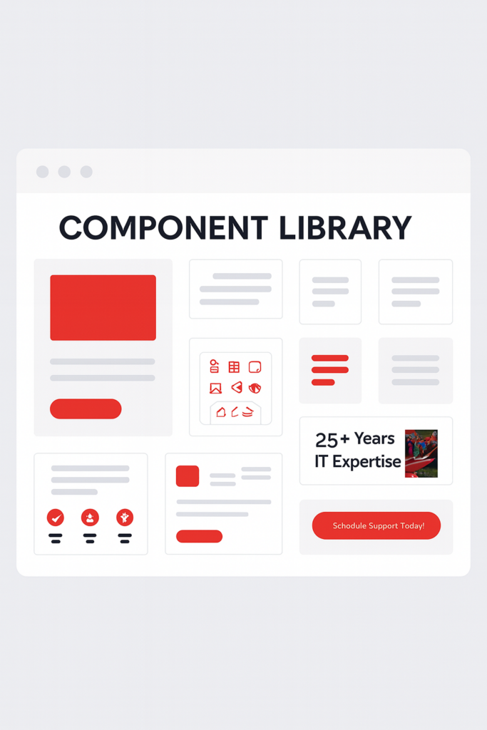
- Color token definition. The black and red constraint was treated as a foundation rather than a limitation. I defined a structured token set: primary, accent, surface, and text roles that gave the palette flexibility across components without losing coherence. This meant red could carry CTAs and highlights without overwhelming the layout, while black anchored structure and typography.
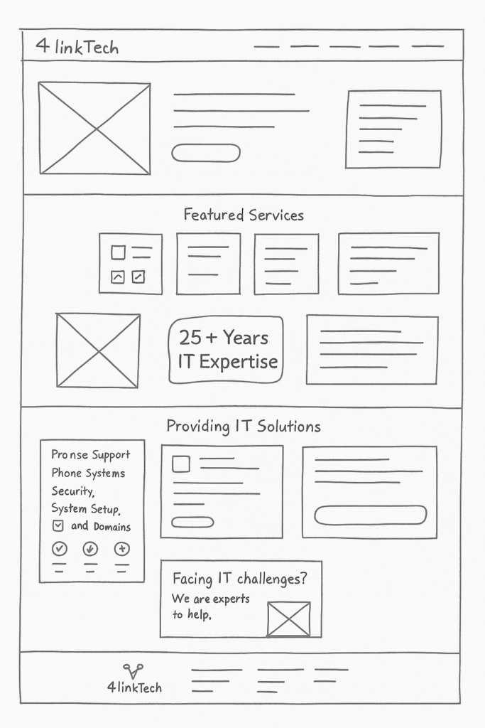
- Component design and build. Working directly in WordPress, I designed and built six core component types that would form the building blocks of the entire site: navigation and header, hero and banner sections, cards and content blocks, buttons and CTAs, and footer. Each component was designed to work independently and in combination, with consistent spacing, typography, and colour application throughout.
- Information architecture. Across 6–10 pages, I mapped the content hierarchy to match how a prospective client would move through the site; from understanding the offer, to building confidence, to making contact. Page structure and component sequencing were driven by that journey, not by what was easiest to build.
- Wireframing and iteration. Before building in WordPress, I mapped user flows and content hierarchy in wireframes to validate the structure before committing to development. This kept the build phase efficient and reduced the risk of structural rework.
- Documentation for longevity. Because the client would be managing the site independently after handoff, documentation was a first-class deliverable, not an afterthought. Style guides, component usage notes, and in-CMS annotations were built to give the client the confidence to update and expand the site without breaking the system.
Solution
A credible, scalable digital presence built to last
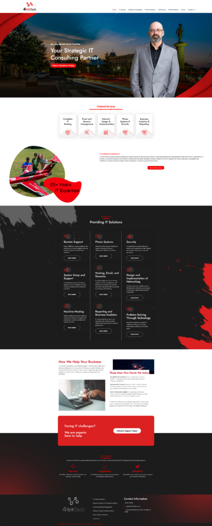
The final site gave 4LinkTech a professional online presence that matched the quality of their service offer and a component system designed to grow with the business.
- A structured black and red visual system that conveyed authority and precision without feeling aggressive or dated.
- Six reusable component types covering every page need across the site, built for consistency and ease of future update.
- An information architecture that moved first-time visitors from awareness to contact in a clear, logical sequence.
- A fully responsive build across all pages, ensuring the experience held on mobile for visitors arriving via Google Business Profile.
- A documented component system in WordPress that the client could maintain and expand independently after handoff.
Outcome
What the system delivered
- Brand credibility established from zero. 4LinkTech launched with a professional digital presence capable of supporting Google Business Profile, client referrals, and organic search, none of which were possible before.
- A system built for evolution. The component-based architecture meant new pages and content updates could be made without redesigning from scratch or reintroducing inconsistency.
- Sole ownership, full delivery. As the only designer and developer on the project, I balanced creative direction, technical execution, and client communication, delivering a complete, production-ready system on time and within scope.