Case Study
Shine ShEO!
Translating a founder's vision into a
User-Centered coaching platform
Note: Some process visuals are withheld under NDA. Where images would appear, their purpose and content are described in the text.
Context
The client and the brief
Shine ShEO! is a coaching platform built to help women entrepreneurs build businesses with clarity and confidence. The founder had a compelling mission and a strong emotional connection to her audience, but her existing Wix site didn’t reflect either. It felt generic, lacked visual authority, and failed to communicate the expertise behind the coaching offer.
My role was to lead the end-to-end design process: from stakeholder discovery through to a high-fidelity UI that could carry the brand’s ambition forward. An added dimension of this project was that the target audience, women entrepreneurs navigating early business growth, was not a demographic I personally belong to, which shaped how I approached my research and design validation.
Problem
Two Problems, not one
The brief surfaced two distinct challenges that needed to be addressed in parallel.
The user problem was clarity. Visitors landing on the site couldn’t quickly understand what Shine ShEO! offered, who it was for, or what action to take. The content said “expert business coaching” but the experience didn’t match that claim, there was no visual hierarchy guiding users through the funnel, and the calls-to-action were buried and inconsistent.
The stakeholder problem was articulation. The founder knew what she wanted the brand to feel like, but struggled to translate that feeling into visual direction. She felt overwhelmed by design choices and wasn’t sure how to balance femininity with professionalism, creating a gap between what she felt and what her users needed.
Both problems needed solving before a single screen could be designed.
Shine ShEO! was using WIX to host and build their website which left it feeling generic and uninspired.
The content on page stated expert business coaching but lacked the matching energy of being an expert business coach.
Research
Understanding an audience I didn't belong to
Because I was designing for a demographic outside my own lived experience, I was deliberate about building empathy before making any design decisions. I reviewed competitor coaching platforms targeting women entrepreneurs to understand established visual conventions in the space and used persona development, accelerated with AI tooling, to map the mindset, motivations, and friction points of users at different stages of their entrepreneurial journey.
Key findings that shaped the design direction:
- Users in the target demographic responded strongly to warmth and approachability, but lost trust quickly if the design felt unpolished or overly casual.
- Authority signals (client testimonials, clear credentials, structured coaching pathways) were critical to conversion for first-time visitors with no prior brand awareness.
- The coaching funnel required a clear sequence: understand the offer → build trust → take action. The existing site collapsed all three into an undifferentiated homepage.
Process
A low-stakes iteration framework
To reduce decision fatigue for the founder and build shared clarity before committing to any direction, I structured the process around what I call a low-stakes iteration framework; a sequenced set of low-commitment touchpoints designed to help a stakeholder react and refine, rather than decide from scratch.
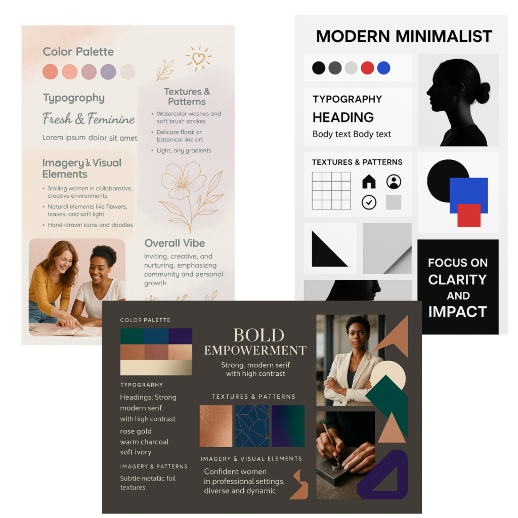
- Mood boards for emotional calibration. I presented three distinct visual directions, bold, soft, and minimalist, and asked the founder to react, not choose. This externalized her preferences without putting the burden of design vocabulary on her.
- Wireframes for functional alignment. Before introducing any color or typography, I mapped the user flow, content hierarchy, and CTA structure to match the coaching funnel. This let the founder see how layout supports strategy and validated the information architecture before we invested in visual design.
- Annotated iterations with rationale. Every design iteration included a short-written rationale explaining why each decision served the target audience. This kept design choices grounded in user needs rather than personal taste and gave the founder a framework for evaluating options beyond “I like it / I don’t.”
- Collaborative pivot and resolution. A pivotal moment came mid-process when the founder moved away from the mood board direction she’d initially responded to, requesting a more angular, structured aesthetic. Rather than restart, I identified a way to honor both: the rounded sun motif from her existing logo was integrated into bespoke design elements that bridged her new direction with the warmth of the original vision. The result felt intentional, not compromised.
Solution
A UI built around trust and clarity
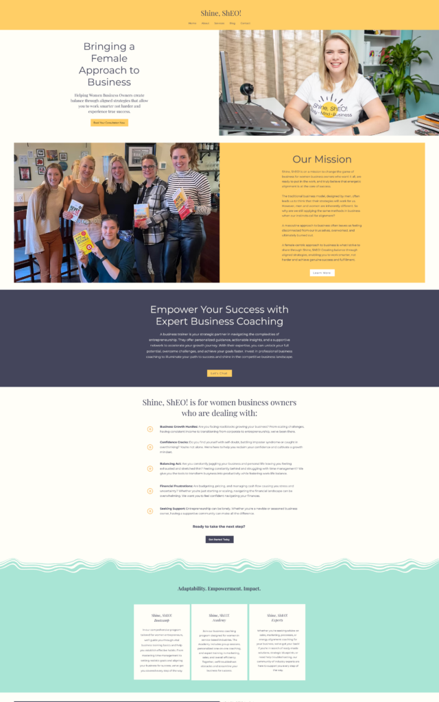
The final design addressed both the user problem and the stakeholder problem simultaneously. The visual system used a refined feminine palette to convey warmth without sacrificing authority, paired with clean layout structures that guided visitors through the coaching funnel in a clear sequence.
- A restructured homepage that introduced the brand, established credibility, and led users toward a clear next action.
- A testimonials section brought above the fold to provide immediate social proof for first-time visitors.
- A newsletter sign-up integrated into the natural reading flow, supporting the client’s email list growth goals without interrupting the user journey.
- Friendly, supportive microcopy throughout, written to reflect the voice of a confident coach, not a generic service provider.
- Full responsive implementation, ensuring the experience held across mobile and desktop for an audience that skews heavily mobile.

Updated content that introduces Shine ShEO! and reflects the design choices that bring a modern touch while still holding true to their vision.
Showing real client reviews giving a stronger authority of trust and experience. Also giving easy access to a newsletter to build email list and fill out a marketing funnel for continued growth opportunity.
Outcome
What changed
Note: As this work was completed through a prior firm, post-launch performance data is no longer accessible to me.
- Stakeholder confidence: The founder moved from design-overwhelmed to confident co-creator by the end of the project.
- Brand alignment: The final design was validated by the founder as accurately representing her mission and audience.
- Funnel clarity: The coaching pathway was restructured with clear sequencing from awareness to action.